What's
the best way to make something stand out? Contrast! A black object on
a white background is simple, clean, and effective. Similarly, a
light object on a dark background calls attention to itself. Contrast
in photography refers to both tonal and color contrasts. It's the
range of shades, from bright highlight to dark shadow. The more
extreme the range, the higher the contrast.
A
professional Toronto commercial photographer knows how to use
make use of contrast creatively and effectively. Here are a couple of
examples of contrasts in commercial photographs.

Notice how the white background and the metal gray borders really
bring out the dark blue color of the conveyer belt. The lines and
edges are very crisp against the white background. The shadows on
this piece aren't very extreme. This is a good example of moderate
contrast.
Morever, the lack of shadows actually balances out the photograph. We
are initially drawn to the dark blue color, but then our eyes move on
to the rest of picture. None of the other details are overshadowed,
making the machine itself – and not a particular component – the
subject of the photograph.

This is another example of contrasting shades. Dark, rich wood
against a completely plain background. The lack of anything
distracting behind the piece of furniture brings out all the little
details; black painted circle in the middle, black-and-red flower
borders, and the metallic-gold carvings on the edges and corners.
The shadows and angle give the subject dimension, but it's not
over-emphasized. Notice how there are no shadows under or around the
object itself. Editing the shadows out gives the piece a very clean,
centralized feel. When you want a stand-alone object to really
capture the viewer's attention, this is the way to do it.
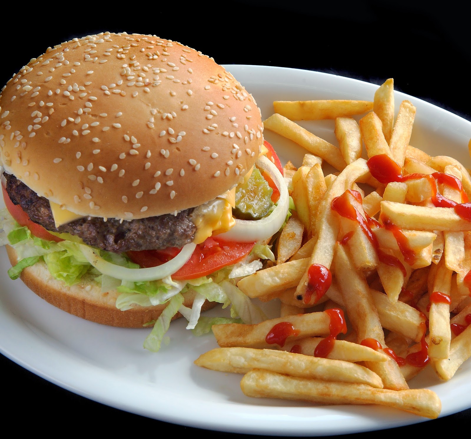
What do you do when there are multiple subjects in the photograph and
all are varying shades and colors? Centralize! Object placement is
crucial here; find a way to group all the objects together without
them looking cramped or forced.
Pick a defining characteristic that all the subjects share, and use
that to create the contrast you need.
In this case, the defining
characteristic would have to be the plate. Since all the objects in
the photograph are being supported by the plate, you'll want the
plate to stand out a little more. White against black equals
beautiful contrast. Your eyes automatically ignore the black
background in favor of the food that stands out beautifully against
the white plate.

This photo of a cosmetic product
makes use of contrast between elements. By itself, on a plain white
background, the jar of mineralized powder would have looked very
clean, yes, but a bit too simplistic
to really catch attention. The colors alone are very basic; black
cover, light pink glass, white background.
The literal splash of
color adds excitement to what could have been an otherwise very
proper, very silent set-up. Colors and shades aren't the only things
you can contrast in a picture. Elements like a rush of activity in
the background against a subject standing still, or a very small
object propped up against a huge building are examples of good
contrast.
This is another example of contrasting elements. Just like the photo
above, this contrasts chaos versus quiet. A blur of activity versus
focus.

Imagine if the background and subject were the same. If the van was
blurred as well, you wouldn't have anything to focus on. You'd be
left looking at a pretty bad picture. If the background and the van
were both still, there wouldn't be a sense of movement. You'd think
the van was parked.
Many toronto product photography services
have professional photographers who understand this concept very
well. When you use proper contrast with proper angling, lighting, and
exposure, the results are nothing short of breath-taking.
No comments:
Post a Comment